Oh hey there, I′m glad you're here!
Join the Email list!
And if you're on the hunt for some top-notch email marketing strategy and conversion copywriting tips - you've come to the right place!
Hi, I'm Allea!
If you’re looking to grow your email list, one of the must-have things you need is a way to GET those email subscribers ON your email list. To do this, you need opt-in forms.
Also called “lead gen” forms, they all do the same thing:
Opt-in forms allow your site visitor to opt into your email list — by sharing their email address with you and giving you permission to send them marketing content — so they can hear from you directly in their inbox.
There are different types of opt-in INCENTIVES, like PDF guides, email challenges, access to a webinar or a video training, or getting a special link to your resource library. (Here are mine!)
And there are different types of opt-in FORMS, like landing pages, pop-ups, an embedded form in your footer, and the like.
Now, knowing where to place your different opt-in forms is an essential component to getting more subscribers on your email list.
We want to make it easy for site visitors to join your email list, right?!
Well, here are 9 locations where you can use opt-ins to show up in front of readers and encourage them to join your email list.
01 | An announcement bar
Using an announcement bar on your website is a simple, yet effective way to grab the attention of your site visitors by promoting a free resource that they can click through to sign up for.
Click announcement bar to open opt-in form
As an example, I have an announcement bar over on the Duett site. I use Squarespace, so it’s an available setting without using any plug-ins or special code.

Not a Squarespace user? Here are some other resources you can use to create an announcement bar on other website platforms:
Use an announcement bar opt-in combo
This is kind of a bonus, merge-the-best-of-both-worlds idea — if possible with your site, you can set up an opt-in form almost as an announcement bar. It shows up on every page, but the user doesn’t need to click through to another page in order to sign up!
See how Stacey does it over at My Kids Lick the Bowl.

02 | A section of your home page
The home page is often the most visited page on your site, so having a section dedicated to promoting your opt-in can help increase your email list significantly. You can either link TO a form, or you can embed the form directly WITHIN the home page.
Embed your opt-in form WITHIN the home page
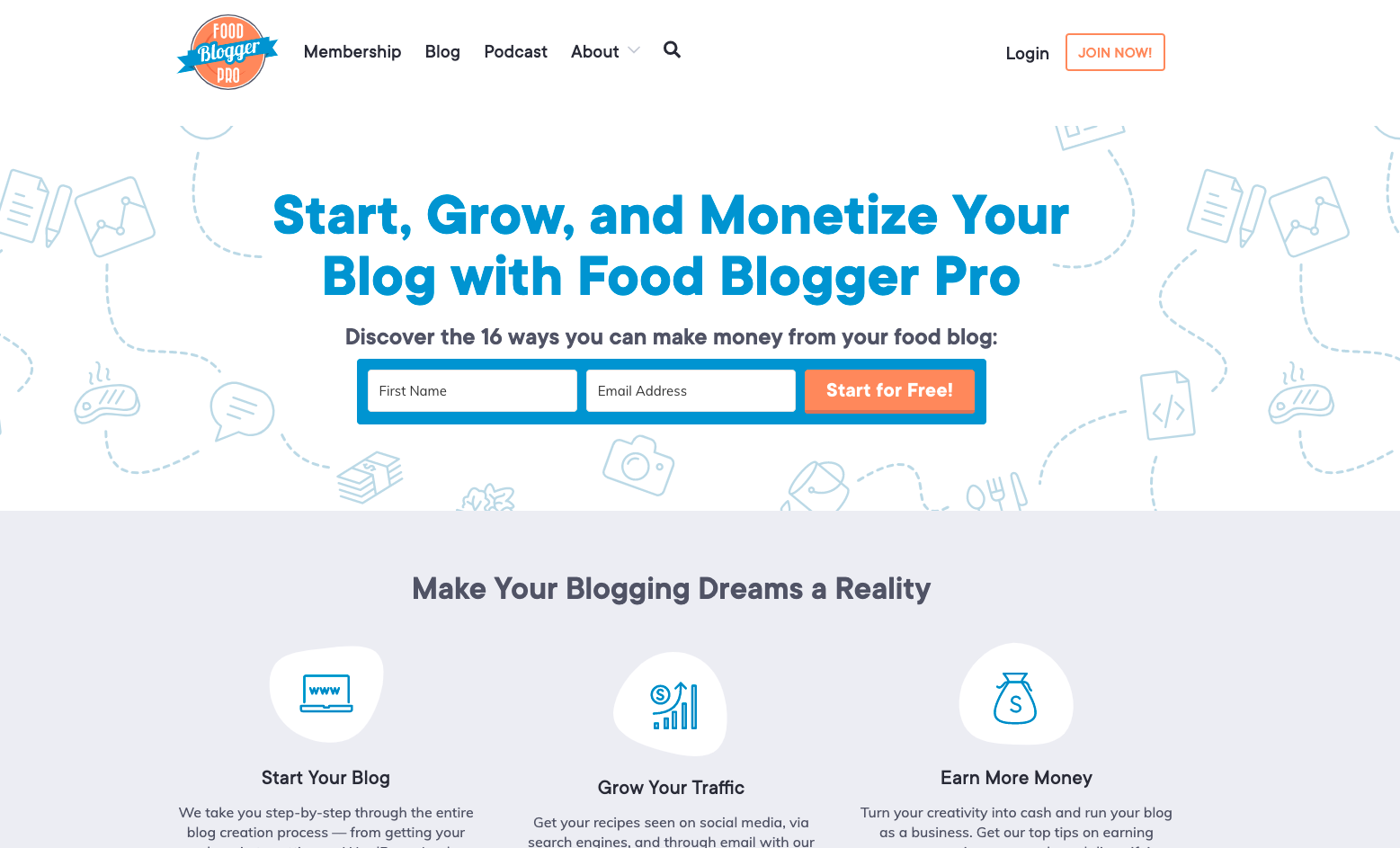
Food Blogger Pro does a great job of this with an opt-in form right at the very top of their website (also known as “above-the-fold,” as if it was the first thing you’d see in a newspaper).
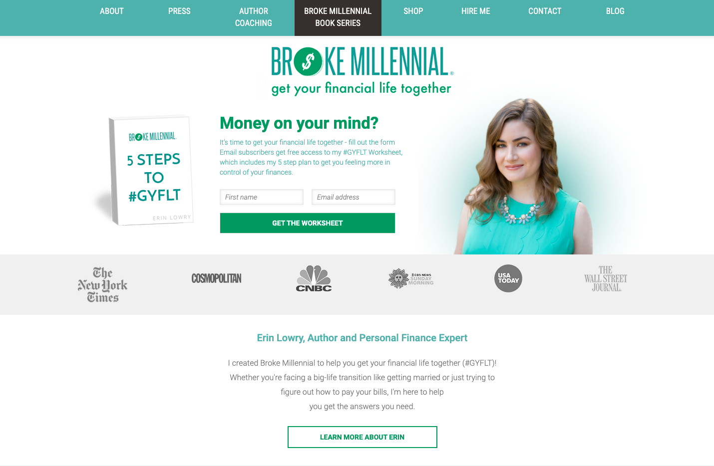
Similar to Food Blogger Pro, Erin Lowry over on the Broke Millennial blog also embedded an opt-in “above the fold” plus an incentive to sign up!
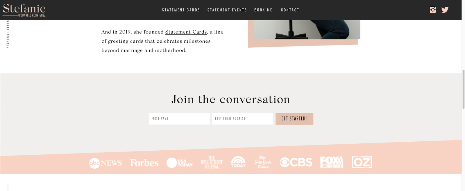
You also have the option of embedding an opt-in halfway down the home page, like what Stefanie O’Connell Rodriguez did on her blog.
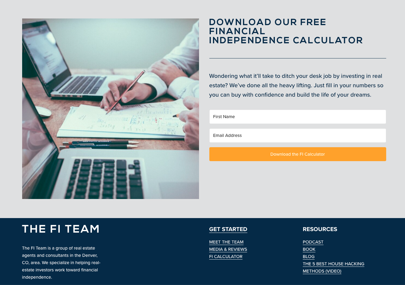
Or you could put it closer to the bottom, like what The FI Team real estate investing website has set up:
Link to your opt-in form FROM the home page
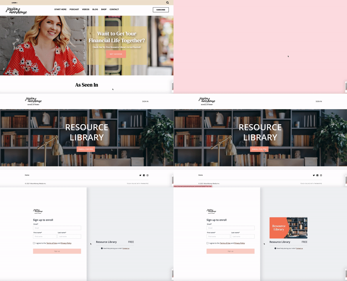
Another option is to have a section on your home page that redirects to your opt-in form. For example, Jessica Moorhouse redirects readers to her free resource library page from the home page.
03 | Your footer
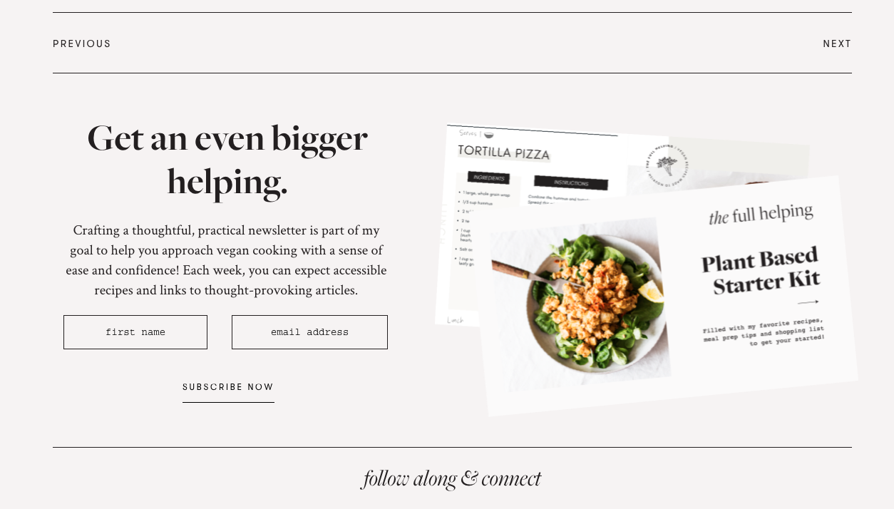
Having an opt-in in your footer is a no-brainer. It is a great way to use the space at the end of your page and will grab the attention of readers who may be looking for more ways to engage with your content.
When it’s part of your website footer, like Gena at the Full Helping has on her site, it shows up on every page of your site (not just your homepage).
04 | On your About page
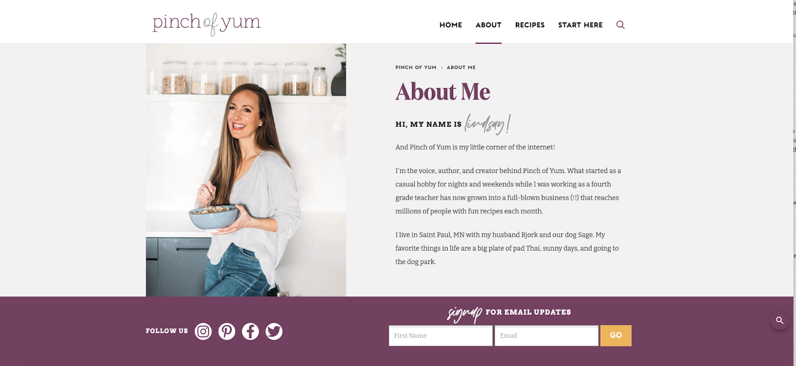
Most potential customers or site visitors will check out the About page (in addition to the home page) — maybe it’s the Nosey Nelly in all of us — to learn more about the face behind brand. Don’t overlook this page when vying for new subscribers’ email addresses!
Pinch of Yum added an opt-in to their About Me page like this:
05 | A landing page (or more) linked from your social media or YouTube pages
Having a landing page on your social media or Youtube channel with opt-ins can be an easy way to grab new subscribers. Plus, when readers click to open the landing page, they can scroll a bit more to learn about the incentive itself (to make sure it’s something they really want).
See how it’s done on the Clean & Delicious Instagram account.
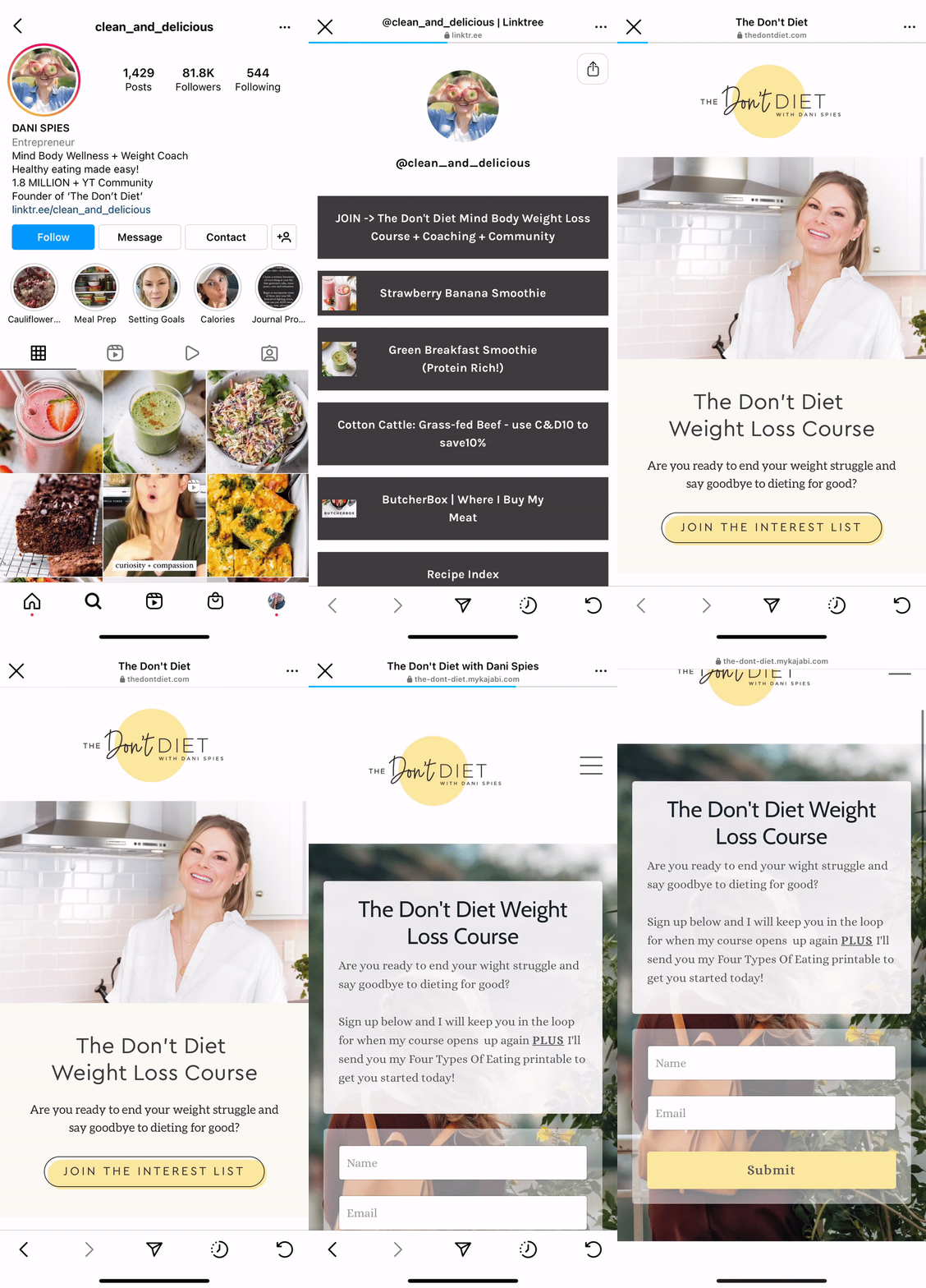
Landing pages are one of my favorite features about Kit. Kit makes it easy to create a beautiful format, brand it to match your website, and snag a URL that makes it easy to link to from your social media platforms.
Plus, it’s easy to create different landing pages for special events or promotions, so you know exactly how new subscribers joined your list. (Learn how to do this in my resource, 7 Ways Email Tags Can Improve Your Subscriber Engagement and Build Brand Loyalty.)
06 | Your blog sidebar
Including an opt-in in your blog sidebar is an effective way to gather more subscribers. It will show up on every blog post someone opens, and if they’ve landed on your blog content — from Pinterest, organic search, or because a friend sent it to them — it’s an easy way for them to get more like it in their inbox by signing up!
Click sign up to open opt-in form
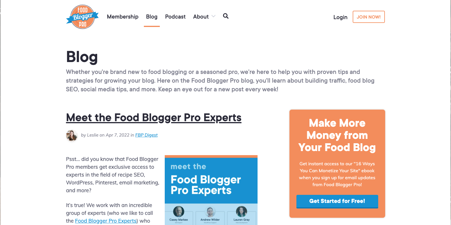
Using this type of sidebar requires readers to click the sign up button and then it produces a pop-up box where they can enter their name and email address.
See how Food Blogger Pro incorporates this sidebar on their blog.
Sign up directly in blog sidebar
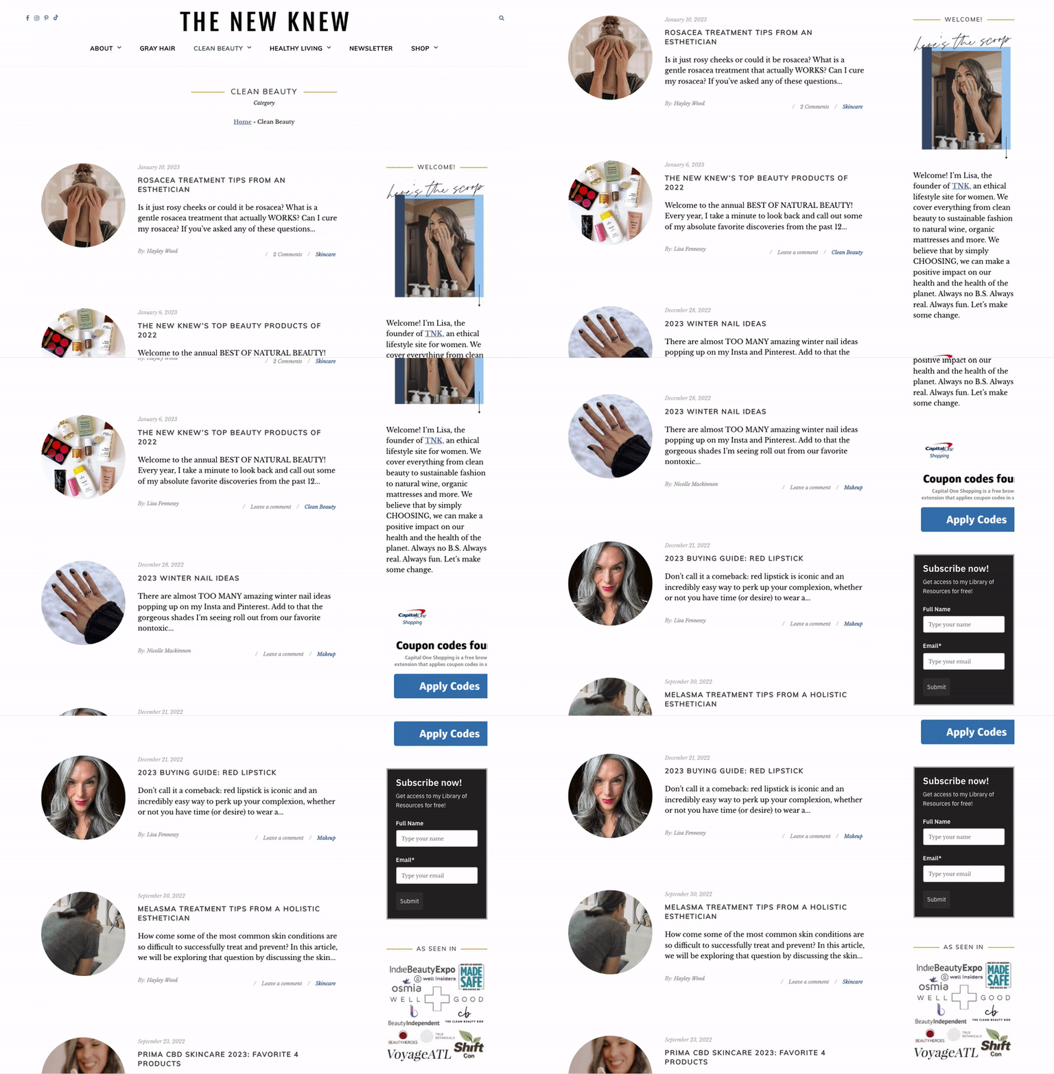
This option makes it easy for readers to sign up by having the space to put their name and email right there, no click required.
The New Knew added an opt-in to their blog sidebar like this:
07 | On blog posts
If you already have people visiting your blog to read your content, you might as well offer them the chance to sign up to get all your latest content and updates!
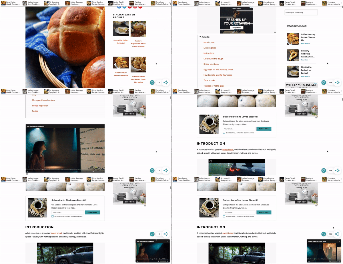
Embedded within a blog post
Mediavine Grow.me offers a great feature where you can embed an opt-in form within a blog post. Here’s a look at it in action on the She Loves Biscotti blog.
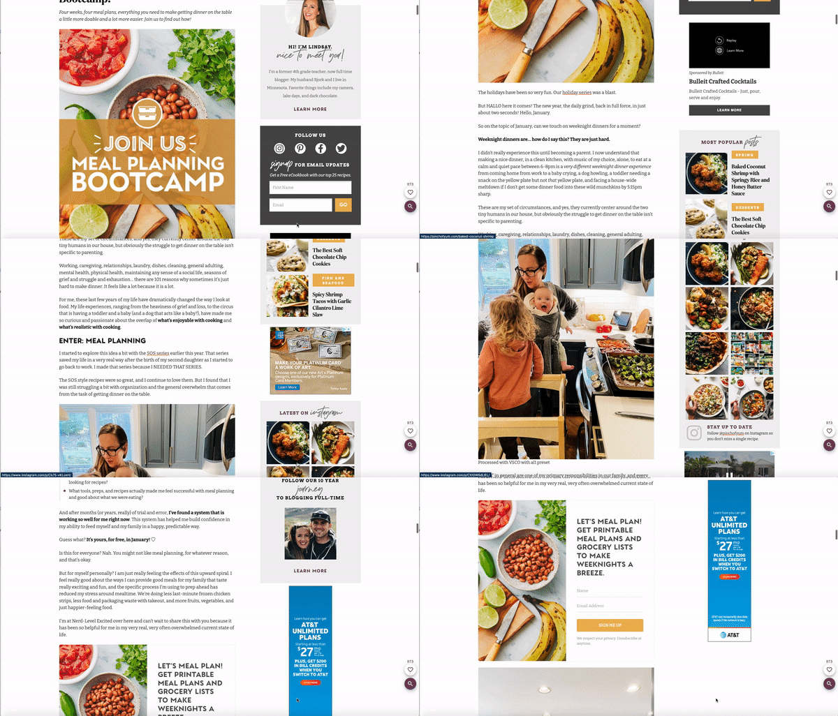
Or check out this example from Pinch of Yum…
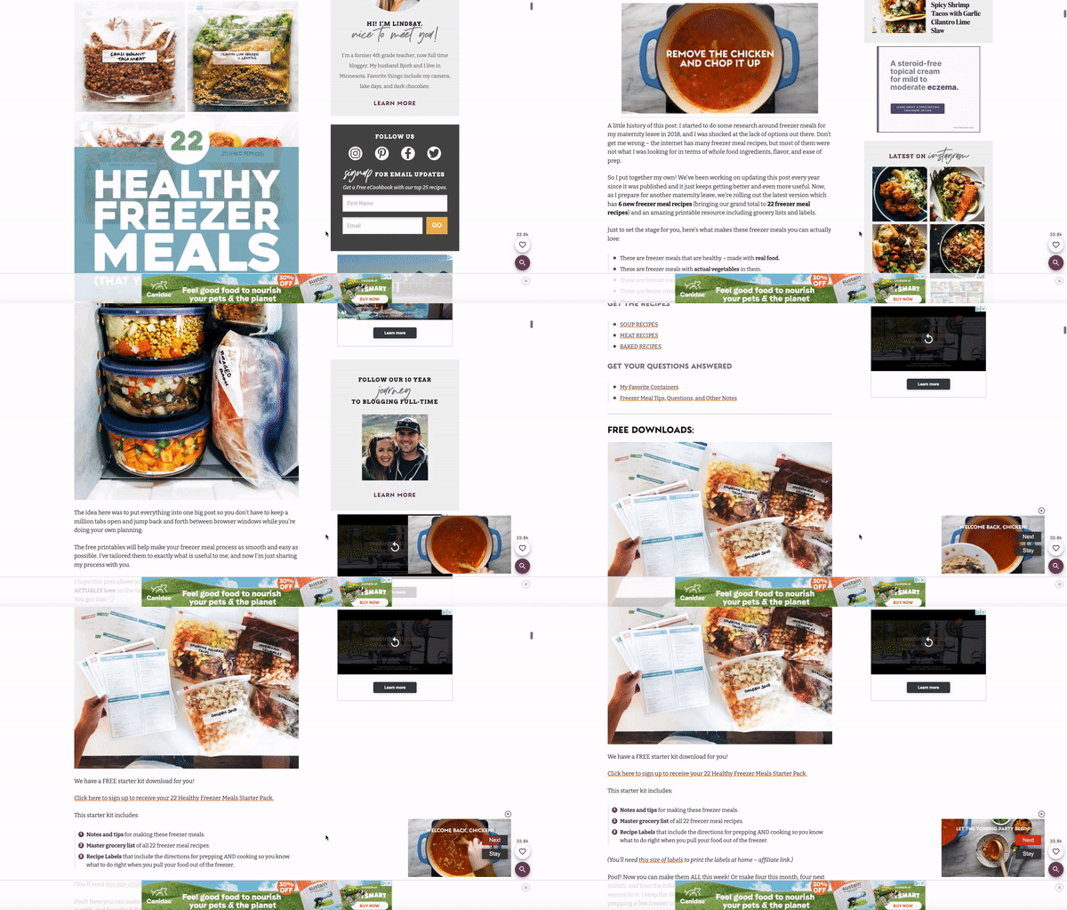
Linked within a blog post
Including a link to sign up for a free resource, like Pinch of Yum did in this blog post, is a great way to increase the number of people receiving your content.
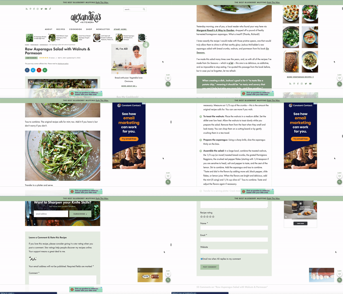
At the end of a blog post
See an example of an opt-in at the end of a blog post on Alexandra’s Kitchen.
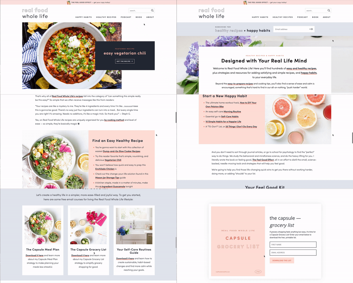
08 | A resources section
Providing a variety of resources for subscribers to sign up for can boost subscribers AND allow you to tailor follow-up content based on which freebies they signed up for.
By having a section dedicated to individual resources available to readers, they can pick and choose which opt-ins they want.
Here is how Robyn shares her main three opt-ins over on Real Food Whole Life:
09 | Pop-up boxes
Automatic pop-up boxes
You can typically adjust the settings of pop-up boxes based on a few factors — how long the reader has been on the page, how far they’ve scrolled through the page (say, 50%) or if the site anticipates that the reader is about to leave the page (that’s called “exit intent”).
Jason Norris uses automatic pop-ups over on his food blog, Recipe Teacher, and they pop up after 30 seconds.
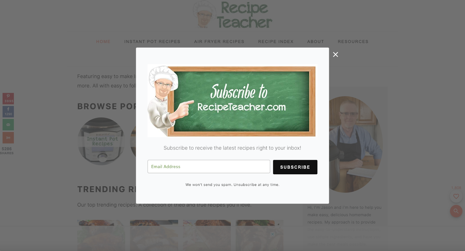
Automatic pop-ups like these can be great for conversions (more on that here), though it could also be because readers want to get the box out of their way so they can read your content. While opt-ins could be good for boosting the number of subscribers on your email list, it could also impact your reader’s experience on your site. That’s something to keep in mind!
If it’s not worth it to you to bother your subscribers with automatic pop-ups (even if it means forgoing that boost in subscribers), don’t use them — that’s totally okay! That’s why I don’t use them on my website.
Click-to-open pop-up boxes
We saw this a few times with other examples above! Food Blogger Pro and Pinch of Yum both use them, whether using a button in their sidebar or a link within the blog content to trigger the pop-up to appear.
Click-to-open pop-up boxes provide a way for you to only show a pop-up box if someone has clicked. Why would this be valuable? So that once the form is completed, the box disappears and the reader can go back to enjoying your blog content as they were before.
Let me know: Which of these opt-in placement strategies will you be adding to your email marketing strategy first?
More like this!:
April 14, 2022
And if you're on the hunt for some top-notch email marketing strategy and conversion copywriting tips - you've come to the right place!
Hi, I'm Allea!
Join the Email list!

If you’re not welcoming new subscribers and pointing them in the direction of your best, most beloved content — or you feel like the one you have isn’t doing the trick — it’s time we fix that. Use this free 5-part framework to make a meaningful & lasting first impression as you write your first welcome sequence for new email subscribers!
Is Your Welcome Sequence Making a Lasting First Impression?
FYI : I sometimes talk about and link to tools, sites, books, and resources that I LOVE. Sometimes those companies give me a little gift for sharing if you choose to purchase something through my affiliate link. I promise to be straightforward with you and to only share things I personally use and would vouch for 100%.
RSVP NOW!
Join us for the next email marketing roundtable, a free live event where we'll clear up any confusion you have around email marketing — so you can get your message in front of your audience, engage subscribers, and optimize conversions for sales and site traffic.
Learn How to Get Your Email Marketing Working Again
Copyright © 2023 Duett, LLC | T&C | Privacy Policy
Brand & Web Design by K Made
Copywriting by Bushel and Bunch
Photography by Rebecca Marie
We’re Duett, an email marketing agency specializing in email strategy, email copywriting, and email automation setup with a special place in our heart for bloggers (especially those who make delicious food). If you’re a content creator craving to authentically connect with your audience so you can build lasting relationships, increase site traffic, and put your best offers forward — Let’s Duett!